The NBA released their City Edition jerseys yesterday, and the New York Knicks are debuting their latest threads tonight.
The NBA just released the 2022-23 City Edition uniforms, which means the New York Knicks City Edition jerseys are available for purchase.
The purpose of these City Edition threads is to help create a special bond between the team, fans, and cities. As Christopher Arena, Head of On-Court, and Brand Partnership at the NBA stated, “the 2022-23 Nike NBA City Edition uniform collection showcases the unique history and culture behind NBA teams, their cities, and their shared bond with NBA fans around the world.”
Jesse Alvarez, Product Director for Men’s Basketball at Nike, adds to the sentiment by saying, “At Nike, basketball is more than just game. It’s an opportunity to bring people together and celebrate community. In our sixth year collaborating with the NBA, we’re putting court, community, and culture at the center of our designs to tell the stories that make each franchise unique.”
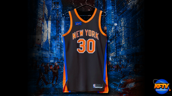
For the third season in a row, the Knicks, Nike, and NBA have collaborated with Kith to design the uniforms. And for this season, the parties decided to take an inverted throwback approach.
Now some are probably wondering how this jersey is an inverted throwback approach. Let’s look at the jerseys the Knicks wore from 1999-2003 (make sure to click my tweet below to see the full image to get a better visual).
The similarities are the following:
- V-neck collar
- The wide seams
- New York is written across the chest
What makes the jerseys different
- The colors are inverted – instead of the black stripes, they are orange and blue
- The Nike NYC swoosh logo
Where to rank the 2022-23 City Edition jerseys?
If you were to ask me where these jerseys rank amongst all the Kith jersey designs, this would be the second-best design.
When I evaluate a jersey, the qualities I look for are:
- Blend of complexity with simplicity
- Color scheme
- Uniqueness
Last year’s jersey was top-notch because it hit all three qualities for me.
The color scheme was on point – you can’t go wrong with a black jersey with orange and blue trim. On top of that, the entire uniform had a lot of complexity in the design. From afar, the outfit looked clean and simple. But, when you looked closely, the jersey top had detail on the seams with the checkered pattern. Then, when you look at the shorts, they had the silhouette for Madison Square Garden with the waistband sporting the numbers of all the retired Knicks.
This year’s uni ranks second.
Now some will probably look at this year’s City Edition uniform and say that it’s too simple, but I would disagree. While the jersey is black with orange and blue trim, the way the border is designed is subtly complex. I appreciate how the sleeves are orange while the seams mix blue and orange. On top of that, the white outlining of the numbers and ‘New York’ makes the jersey extra crisp. And once again, the color scheme is on point.
(I am also a sucker for the tribute to the Allan Houston and Latrell Sprewell years, so that is bonus points for me).
The 2020-21 season City Edition unis would be my least favorite. The color scheme was on point, but the circular logo with “City Never Sleeps [,] New York Knicks” was simple and not complex. Furthermore, the shading of the numbers went from a blue-ish purple to black and didn’t make the digits pop as they should have.
Now don’t get me wrong, this jersey was unique. More unique than this year’s City Edition jersey. But the level of uniqueness doesn’t outweigh the blend of intricacy and simplicity of this year’s jersey.
Stay tuned to KnicksFanTV.com for the latest Knicks news, rumors, and recaps throughout the NBA season. And in case you missed it, check out CP touring Chris Shammas’ Knicks Fan Cave!


